Supplementary Material for „Color Appearance Rating of Familiar Real Objects Under Immersive Viewing Conditions“
Report of the results of the online survey on memory colors
With the concept of memory colors being considered to play a crucial role for many imaging and lighting applications, the questions how people assess the color appearance of familiar objects and what kind of fundamental characteristics can be derived from these assessments have extensively been studied in the past. However, all of these studies lack in realistic viewing and adaptation conditions. In the attempt of overcoming these deficiencies, a new experiment investigating the impact of long-term memory on the color appearance ratings of twelve familiar test objects was performed. For an appropriate object selection, an online survey had been performed in advance whose results should be reported in the following.
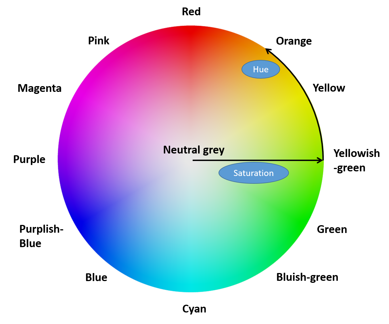
In the survey, which was distributed in German language, participants were asked to name objects that first came into their minds when they think of a specific color. Before starting with the survey, they received thorough written instructions explaining the characteristics of memory colors and giving a short introduction to the color attributes hue and saturation as defined by the hue circle shown on the right.
As can be seen, this hue circle was divided into 13 segments (12 color segments plus “neutral grey” to describe colors on the neutral axis), where the color naming of these segments was basically adopted from Ref. [1]. Please note that due to the more commonly used and familiar color names in German language of “pink” for purplish-red, “magenta” for reddish-purple and “cyan” for greenish-blue, the color names in these three cases were substituted accordingly. The resulting 13 color names indicating a specific hue characteristic were eventually used to run the survey.
Regarding the explanation of the concept of memory colors, special care was taken to impart the original definition as devised by Hering [2] who used this term to describe the typical color an individual observer has in mind when thinking of or looking at certain familiar objects that he or she acquired frequently and memorized stably through his or her experience with the respective objects. To ease the task of naming such objects, participants were advised to think of everyday objects, groceries, plants, etc. that could be found at their homes or were part of their daily routine. Excluded from the survey were only those “objects” that are non-physical, i.e., naming the object “sky” or “water” for the hue region of blue was not allowed.
In a pre-test conducted among our faculty staff, participants were further asked to distinguish, if possible, for each given hue region between saturated and desaturated objects. In general, participants were not able to fulfill this task with a clear and obvious tendency, except for the hue category of “yellow”, where a clear distinction in object naming could be made between the very saturated objects like banana or lemon and the more desaturated, more yellowish-brown objects such as butter, beeswax, or sand. Based on this clear tendency from the analysis of the pre-test we decided to adopt this distinction between saturated and desaturated yellow objects also in the main survey and, thus, created a further 14th color category.
The link to the main survey was eventually distributed by mail and via the homepage of the Deutsche Lichttechnische Gesellschaft e.V.. Following this link, participants were redirected to the corresponding landing page giving further details on the test procedure. After reading the instructions, as described above, participants could start with the survey whenever they were ready. For each hue region, the task was relatively simply formulated: Please name at least one green/cyan/orange… object. It was always possible to skip the question, if one was not able to name any object at all. No time limit was given to finish the survey. The answers of the participants, which were stored in a database, were subsequently analyzed. The corresponding results are visualized in the Sliders 1 and 2 on this web page, where, for each hue region, the former shows the percentage of participants naming a certain object while the latter gives an overview of the absolute frequency of responses. Please note that an additional clustering has been applied, which was motivated by the following:
1) Objects named for magenta and pink were in most cases interchangeable so that it was decided to combine them to one single magenta (more common in German language) category
2) Indigo blue basically summarizes the results obtained for the original blue category. It was relabeled due to the objects named in this category in order to emphasize that they all belong to that specific kind of blue, which is the typical color of Nivea tin, blue ink and blue jeans (the most frequently named objects).
3) Most of the objects originally named in the green category were also found either in the yellowish-green or in the blueish-green category. That is why, like in the case of pink and magenta, it was decided to combine these categories to finally end up with two somewhat more distinct categories yellowish-green and blueish-green.
4) Regarding the desaturated yellow category, relabeling to “tan-yellow” was performed in order to better match the color characteristics of the most frequently named objects.
Based on the statistics and clustering, the following familiar test objects were chosen for performing the experiments reported in the paper: banana (yellow, named by 56 % of the subjects), green salad (yellowish-green, named by 32 % of the subjects), broccoli (bluish-green, named by 38 % of the subjects), blue jeans (indigo blue, named by 55 % of the subjects), blue berry (purplish-blue, named by 41 % of the subjects), red cabbage (purple, named by 12 % of the subjects), red rose (red, named by 48 % of the subjects), carrot (orange, named by 27 % of the subjects), butternut squash (tan-yellow, named by 29 % of the subjects), and concrete flowerpot (neutral grey, named by 45 % of the subjects).
Please note that for the specific hue regions of orange, yellowish-green, and purple the finally selected test objects were not the most frequently named ones in the online survey – actually the objects of orange (named by 62 % of the subjects), green apple (named by 47 % of the subjects), and aubergine (named by 42 % of the subjects) should have been considered in first place. However, pre-tests performed with these objects revealed that their surface characteristics are not Lambertian enough so that, instead of being diffusely scattered for a homogeneous illumination of the test object, the light emitted from the projector and sent upon the object’s surface caused to much disturbing reflections into the observer’s eye. For this reason, it was decided to choose the second or even third (in the case of red cabbage) most named object, which did not show such perturbations on its surface, for the final experiments.
All in all, it can be concluded from the analysis of the survey that for some parts of the hue circle (yellow, red, orange, etc.) there was no problem to find a various number of different characteristic objects, for other parts (magenta, blueish-green, cyan, etc.) on the other hand it seemed to be more difficult for the participants to name such objects and if they did, they were mostly artificial or printed (e.g., the Siemens logo for cyan). Consequently, these hue regions were excluded from the present study since due to the non-existence of naturally colored objects in these areas they seem to play only a minor role for the investigation of long-term memory color effects. Nevertheless, it is interesting to note that the most frequently named characteristic object of all hue regions was the logo of the German Telekom for magenta which is most likely due to the omnipresence of the brand in German advertising and TV. A similar argumentation holds for the second most frequently named object, which is the fruit of orange for the color of orange. In both languages English and German, the names of the fruit and of the color are identical which obviously induces an immediate association in people’s brains.
[1] L. Kelly and D. B. Judd. Color: Universal Language and Dictionary of Names. US Department of Commerce, National Bureau of Standards, Spec. Publ. 440, Washington, USA, page A-7, Table 1; 1976.
[2] E. Hering. Grundzüge der Lehre vom Lichtsinn. Berlin: Springer Verlag; 1920.
Contact: Dr.-Ing. Sebastian Babilon